read case study

AI Prototyping

UX delivery with Figma Make, lovable, v0 and cursor (MCP-connect) workflows.
Prompt window side-by-side with a Payment checkout process step for entering the payment method
overview
purpose
enhance UX delivery with speed, interactability and fidelity/details
applied skills
vibe coding, CSS & HTML
focus
AI prototyping based on design systems
AI prototyping for fast built and interactability
AI prototyping for quick A/B testing
outcomes
Platform page design with full brand & existing UI adherence
50% faster prototype built
More efficient workflow for testing complex element variations, e.g. tables
2025 - current
AI Prototyping

Figma Make

Platform page design for brand adherence
The problem at hand
Complex platform build (full-screen) with the possibility to transfer code to an existing codebase and therey keeping the structure, layer naming as well as branding in mind, was to be solved.
The main goal was to NOT break existing structures, like the pre-build design management system that carries styles, behaviors and branding, because they were already coded and a re-build would result in more effort and no buy-in for stakeholder like PO, developers as well as C-suite.
Figma Make prompt window side-by-side with output UI of a dashboard
My approach (with Figma Make)
The starting parameters for the project were:
Design Management System
It carried branding, components style and their behavior
Two sample screens
Mid-to high-fidelity prototypes (structure and layers) helped the AI with interpretation towards target outcome
Iterative description for fine-tuning and for target behaviors
Prompting fixes to style and enhancing behaviors of components that was not part of the design management system
Figma Make prompt example
Accuracy in the prototype took some time to reach through prompting, so I also chose the alternative route of searching and manipulating classes and CSS myself.
Figma Make CSS structure
The outcome
The prototype showed target behavior of anchoring the tabbar with scroll, and also maintaining responsiveness of the table on screen re-sizing. In addition, branding was adhered and components matched already implemented states, so developers could continue building from there.
Animation of a monitoring dashboard with a side navigation, where a tab bar anchors on top of the screen with scrolling down

lovable

Fast built of checkout process behavior
The problem at hand
Efficiently and quickly test acceptance, validity and feasibility of a 2FA method - via email - in a payment checkout process, in order to have a basis for discussion with developers, PO and legal.
It needed to be tested and understood, whether an email-enabled 2FA method is being detected as "fraud" or whether an account email address can be coupled to a payment process.
To test the hypothesis and to have a basis for discussion with mentioned stakeholders, the final step in a checkout process has been designed/ai-coded with lovable, where users would enter their credit card information, followed by entering a 4-digit authentication code.
Screenshot of a checkout process for user authentication
My approach (with lovable.dev)
Starting with a set of instruction for the initial build included setting base parameters for:
Layout
Colum structure design, stepper design and radio button switch functionality
Style
Color for CTAs, background and states
UX writing
Initial wordings and details for buttons, copy text, placeholder texts
lovable prompt design - initial build
Prompt window side-by-side with a Payment checkout process step for entering the payment method
Apart of working functionalities like radio buttons with their respective UI content (clickable), the CTA on the first screen of the credit card option "Pay now" starts the user journey of credit card usage: An automation fills the input fields and navigates to the 4-digit screen.
Since the focus is on the screen for entering 4 digits and not on entering the credit card information, users should not be irritated with details, but only holistically understand what is going on, a typing-animation made most sence can could be coded very easily.
lovable prompt design
Fine-tuning the application was done in two ways: on the on hand, there was prompt-based refinement, e.g. for EUR-formatting. On the other hand, custom manipulation of the CSS /HTML code has been done in lovable for color adjustments, border parameters or paddings/margins.
The outcome
An interactable prototype that gives the opportunity to test with stakeholders acceptance, feasibility and legal aspects of this user journey
Animation of a checkout process for user authentication
AI prototype (live)
external link to lovable.dev

v0 (Vercel)

Prompt complex elements for A/B testing
The problem at hand
When an application consists of more then 75% data tables, which carry a lot of information, it becomes difficult to scan and navigate them, leading to inefficiencies. This is what happened here:
User’s journeys break (identified with analytics tools), when trying to find information, because of the set-up of tables: One table row carries only 7 items in total, so further, important information is situated in a sub-table, which should also be sortable and filterable.
With more and more complaints about being not readable, not responsive and a burden to the eye, the idea was to make a quick A/B testinging on a different approach with real data, style as well as accurate behavior: Let the information be displayed in a modal overlay on click of a table row, so users keep their focus on the taks at hand by visually separating the two tables.
v0 - final output modal overlay design showing contract details
My approach (with v0)
With v0, I started with a set of instructions, providing the base parameters and restrictions
Layout
Table format with column hierarchy and column characteristics
General idea of an expanded area
An open description, of "solving the problem" of a text element outsourced to somewhere elese than a sub-table
Responsiveness
Behavior of the table, when screen sizes get reduced
Vercel v0 Prompt 2Vercel v0 Prompt 1
v0 - iteration of table design showing contracts
The first output was disappointing due to the nature of my prompt and was far away from a good and expected User Experience: It missed the point of showing data - that is sortable, filtarable and in the end comparable - in a structured format in another area than the table.
There was also no branding in the application yet, so the next step was to enhance and refine my prompts iteratively to fix mentioned issues.
The following screens show the output of the iterations:
v0 - iteration 2 of table design showing contracts
v0 - iteration 3 of table design showing contracts
For the A/B testing, the expanded area was important to get right, so another set up iterations went into fixing layout, style and behavior:
v0 - side-menu to table design showing contract details
v0 - modal overlay to table design showing contract details
The outcome
A responsive, sortable table - designed for the target audience (handling contracts) - assimilated to the existing user experience to make A/B testing possible, was provided. On click of a table row, an overlay modal opens.
v0 - final output table design showing contracts
v0 - final output modal overlay design showing contract details

My learnings

Efficient way of working with AI
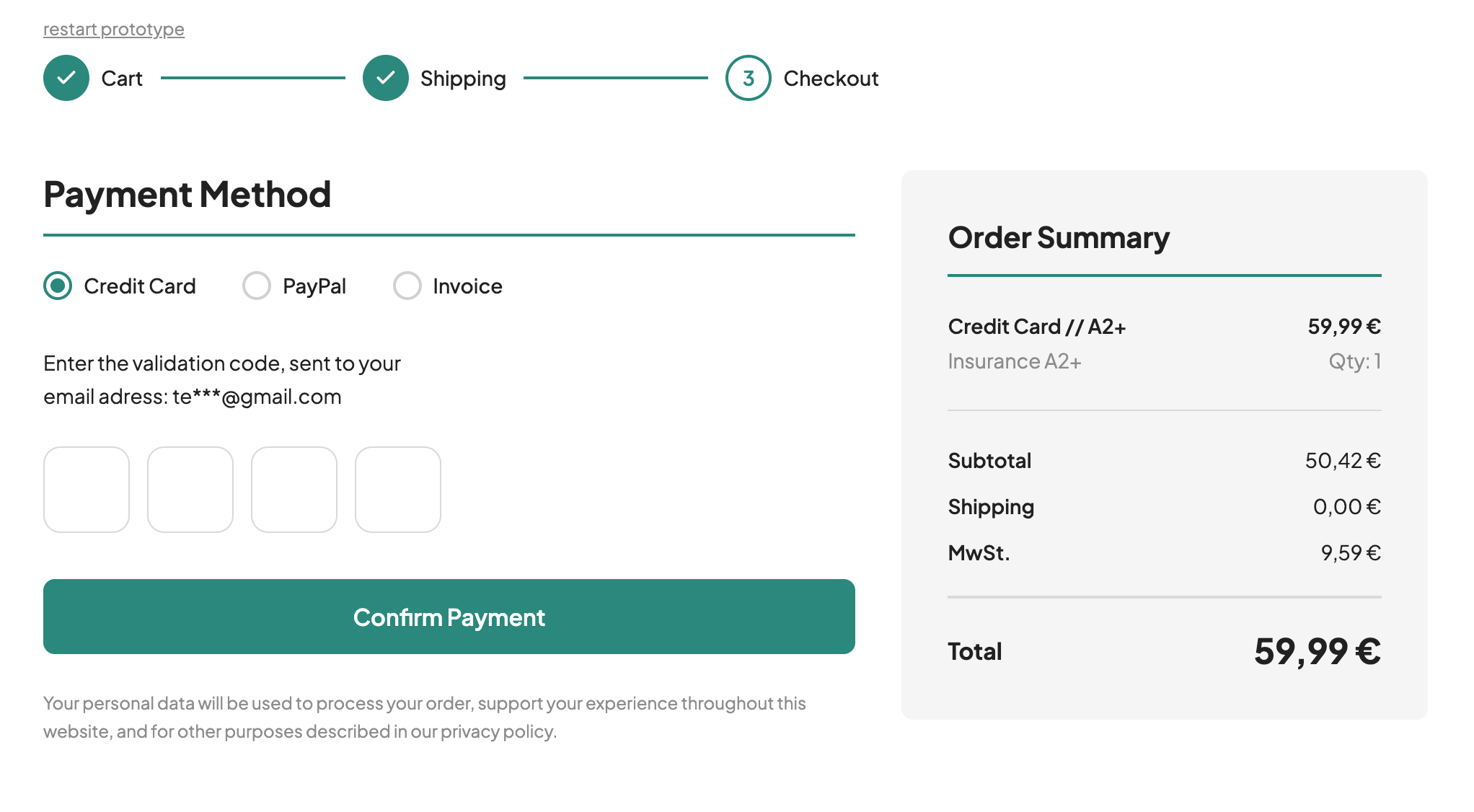
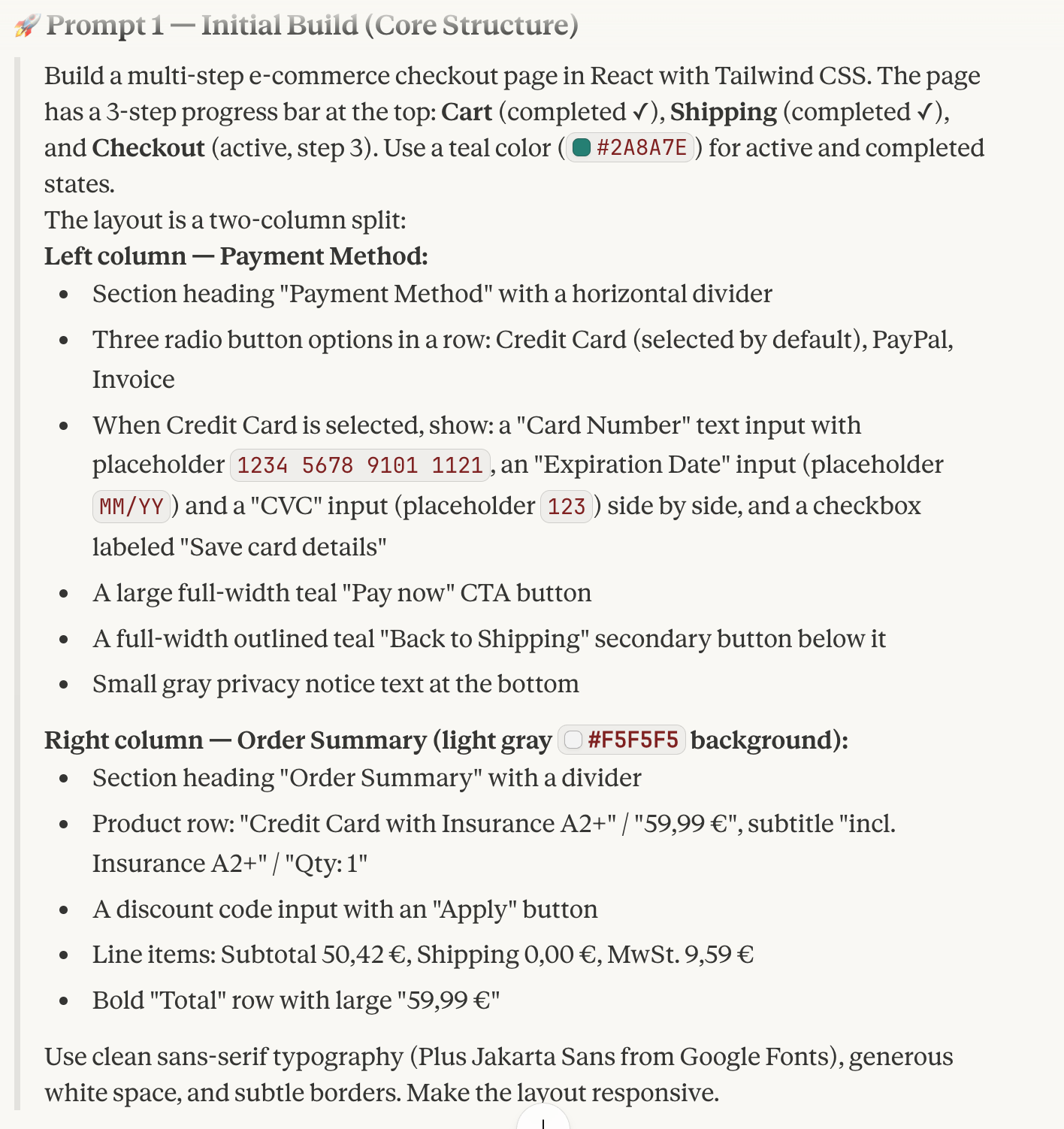
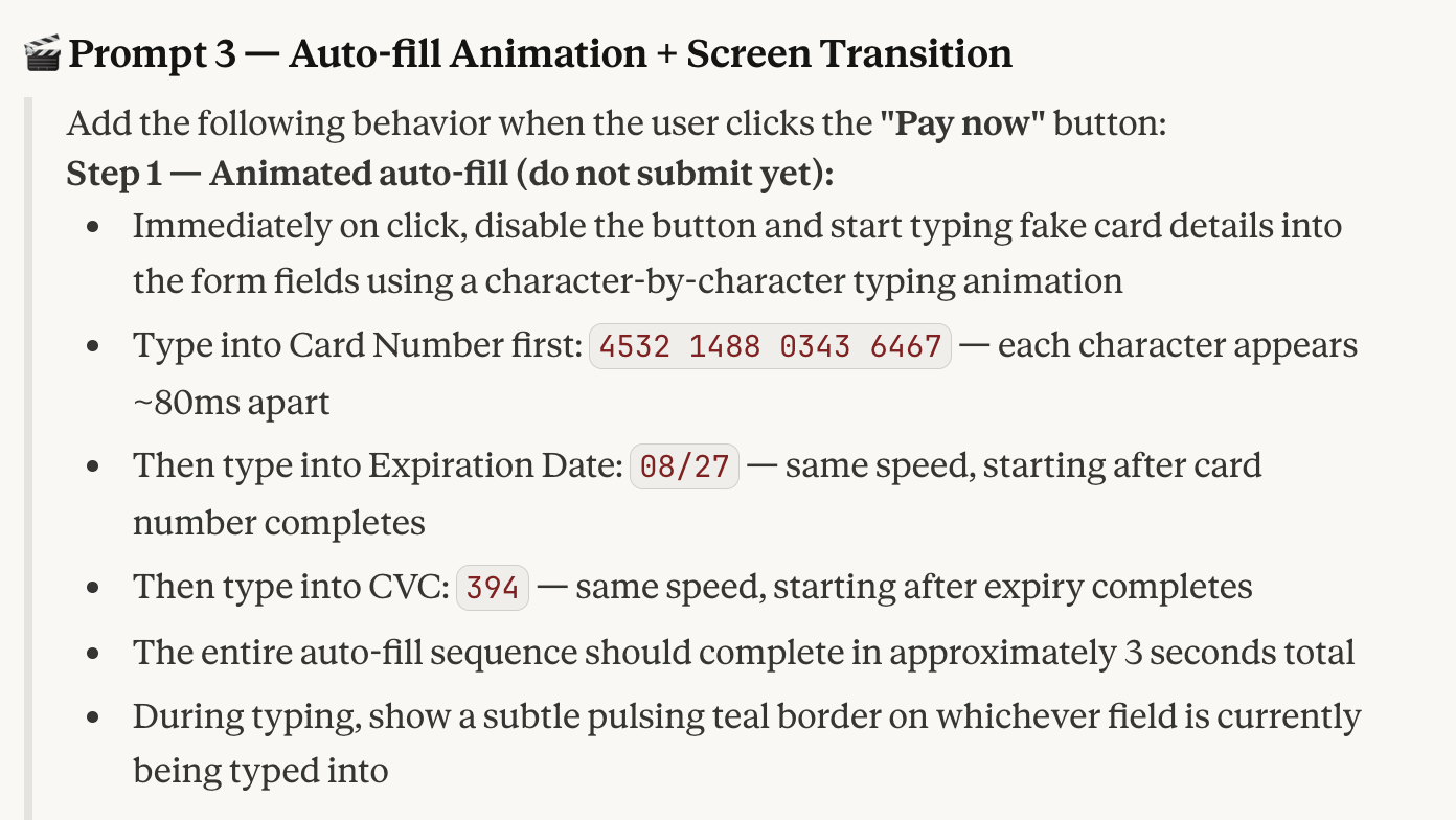
Better input = better output
Whether working with an existing design management system or creating a PRD (Product Requirements Document) with Claude, ChatGPT or others, the input defines the output and the number of iterations to be done later on.
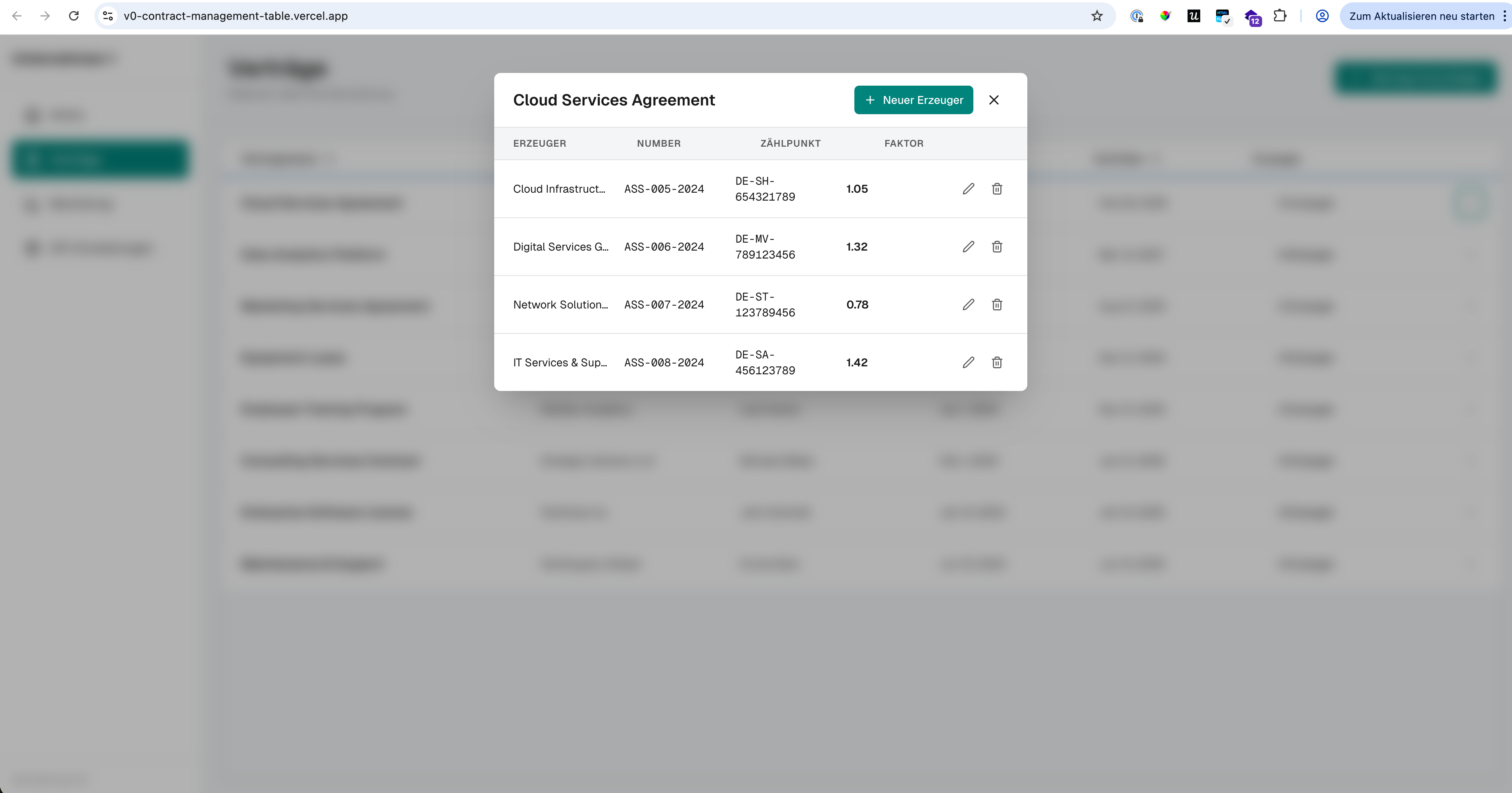
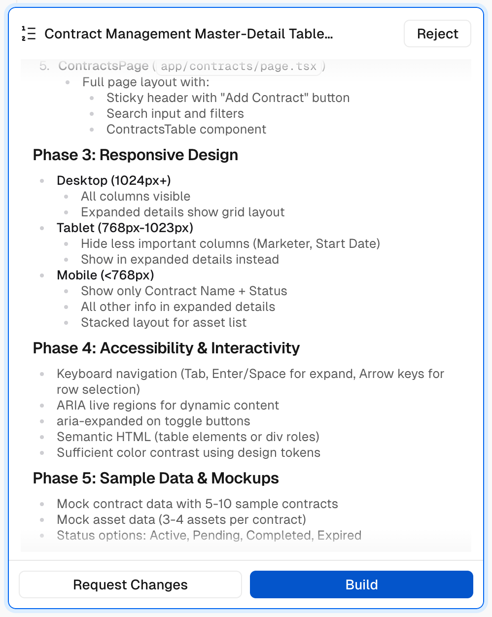
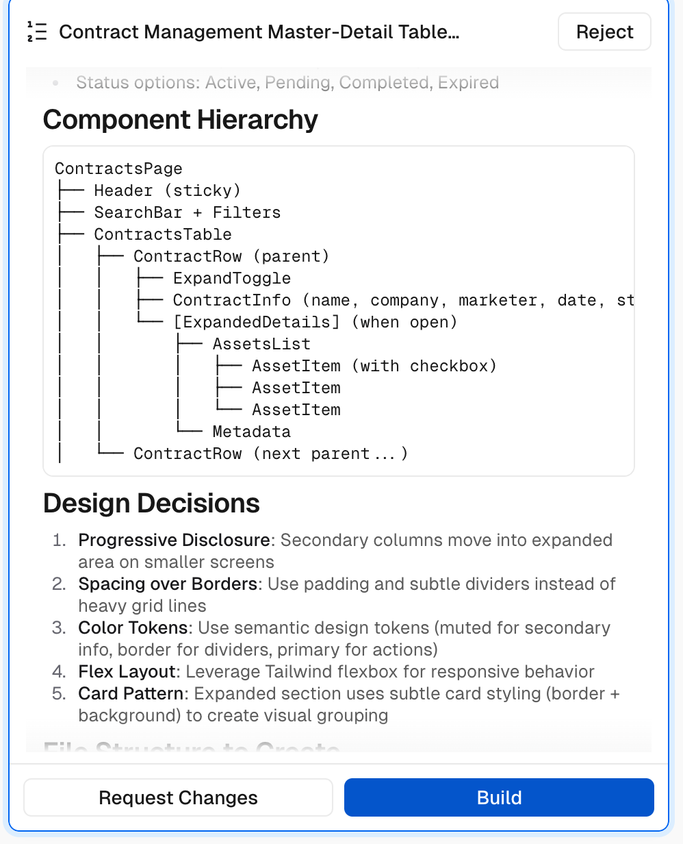
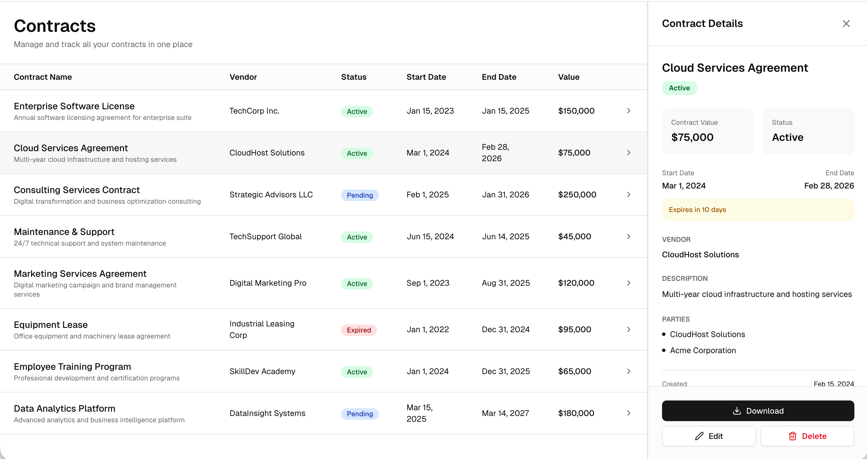
This is especially true for larger and more complex feature developments, like responsive table designs, so the solution proposed by an AI doesn't differ significantly from your target in the first run.
Without guidelines, the AI hallucinates too much on the target design, leading to longer, more cumbersome iterations, and potentially missing the point of the prototype.
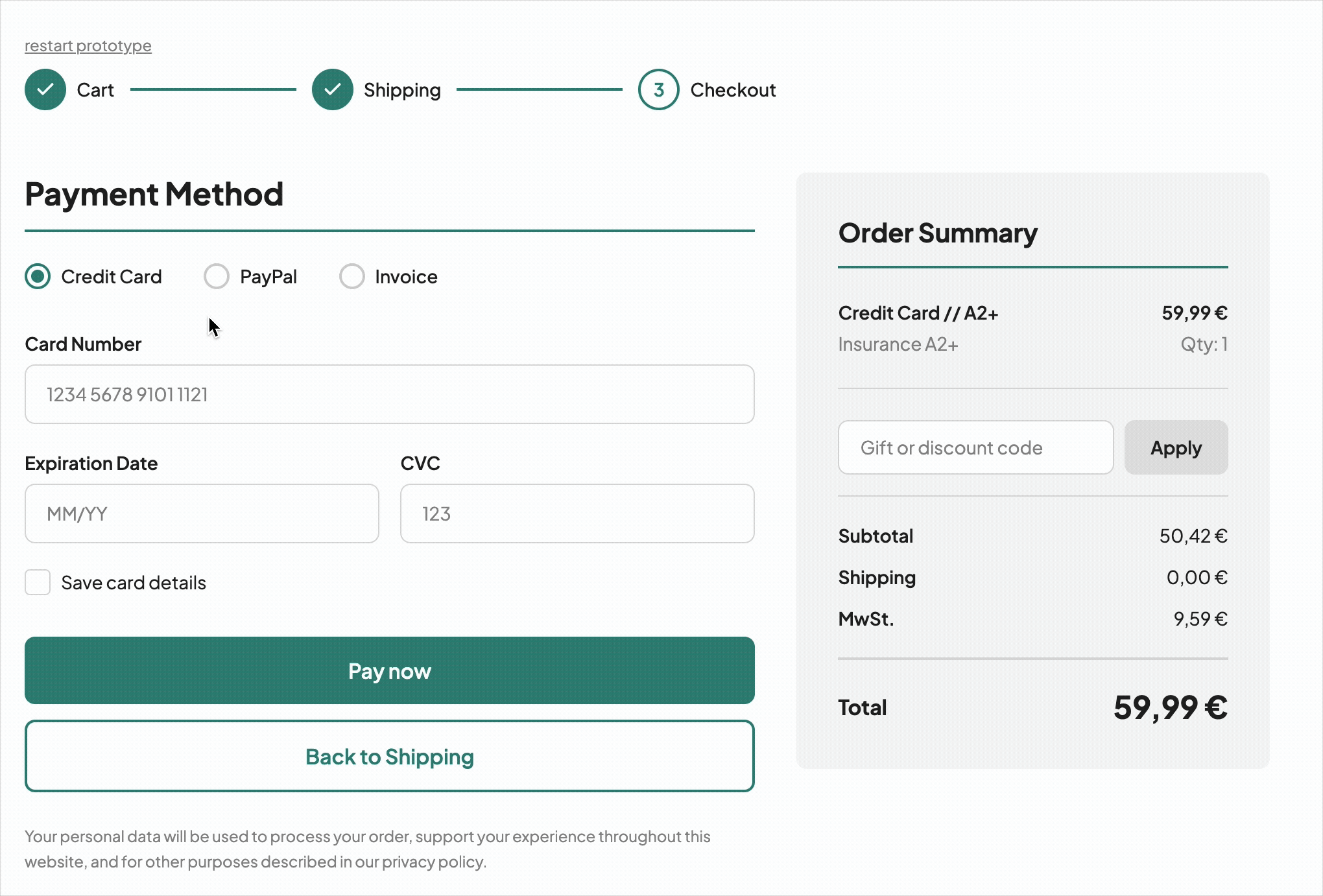
Different AI tool = different (main) purpose
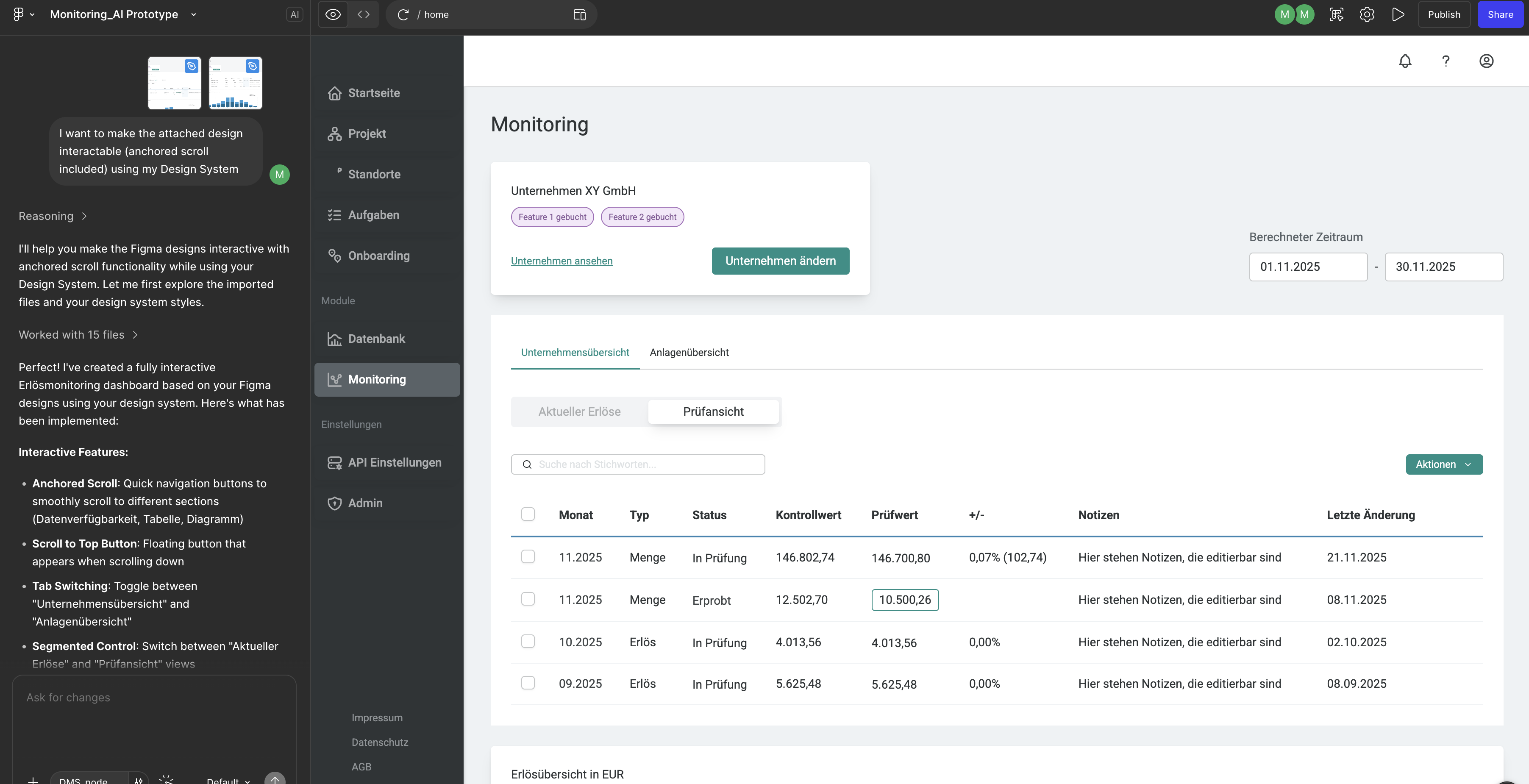
While Figma Make is a good choice, when it comes to iterating based on a foundation (like an existing design system) or with an existing set of screens, that can be taken as a reference (Lofi or Hifi), lovable and v0 are much better, when it comes to use-case specific, highly interactive builds of the ground, when a set of instructions is given.
Figma Make, compared to lovable and v0 is much slower for tiny, quick edits, which could slow down the workflow as well. lovable and v0 facilitate fast editing, also in CSS and HMTL more naturally.
These are two different approaches, which come with product design dependencies, project build speed and accuracy in output.
Dual vibe-coding approach
At the moment, the most efficient workflow for me is a combination of both prompt-based AI-tools for quick prototyping and the possibility to manipulate the generated code in CSS and HMTL, in order to gain maximum speed and accuracy.