User Management was selected as a priority improvement because it directly affects daily operations for administrators. The goal was to make managing users, roles, and agreements easier to understand and faster to execute — without disrupting existing business logic.
Reframing Admin User-management
turning a critical B2B workflow into a clear, user-friendly experience
overview
company
AirPlus International
industry
Financial, Payments
applied skills
UX Design; UI Design and data visualization; User Research and Usability Testing
focus
Platform re-design for complex problem-solving
Rapid prototyping and experimentation for quick user testing
outcomes
35% reduction in time for task completion for user-role assignments
Higher task success rate for first-time administrators
Jun 2021 - Nov 2022
REFRAMING USER-MANAGEMENT
context & problems
The situation at hand
An interface shaped by time, not intent
Background: As customer adoption grew, so did the number of users, agreements, and role combinations. The existing User Management UI had evolved incrementally, resulting in outdated interaction patterns and increasing cognitive load — especially for administrators managing multiple contracts.
Complexity without clarity
Three key challenges describe the core problem:
Fragmented views and workflows
Users had to switch between multiple views to manage roles and agreements, preventing global actions and increasing error rates.
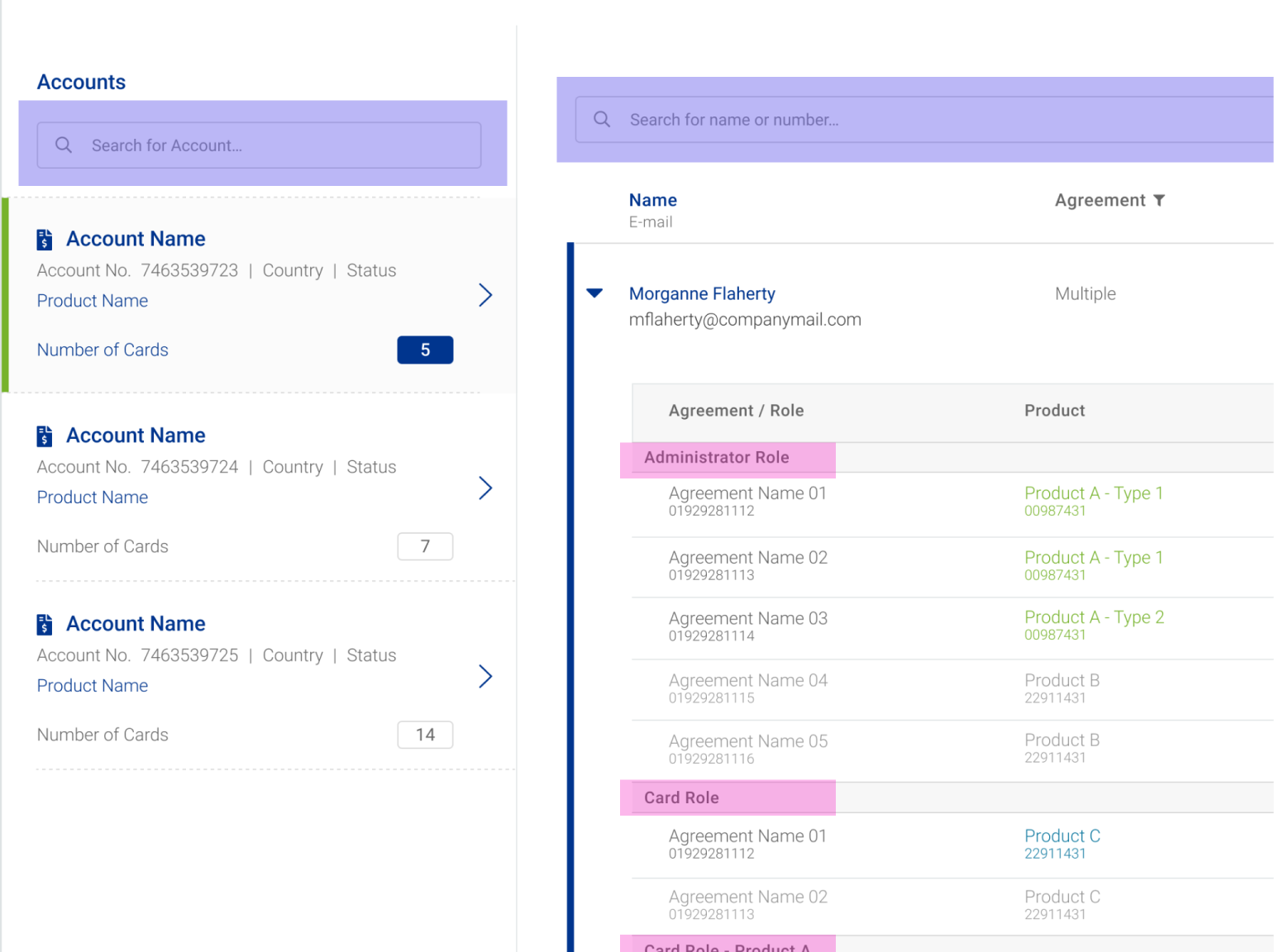
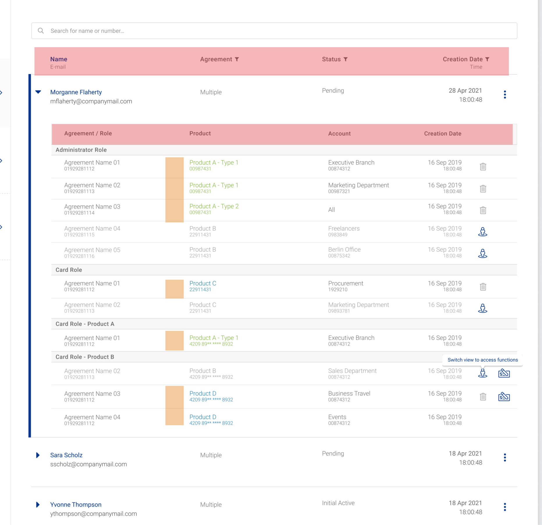
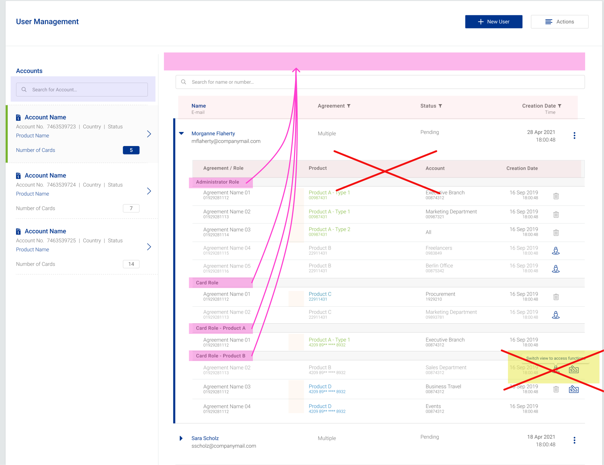
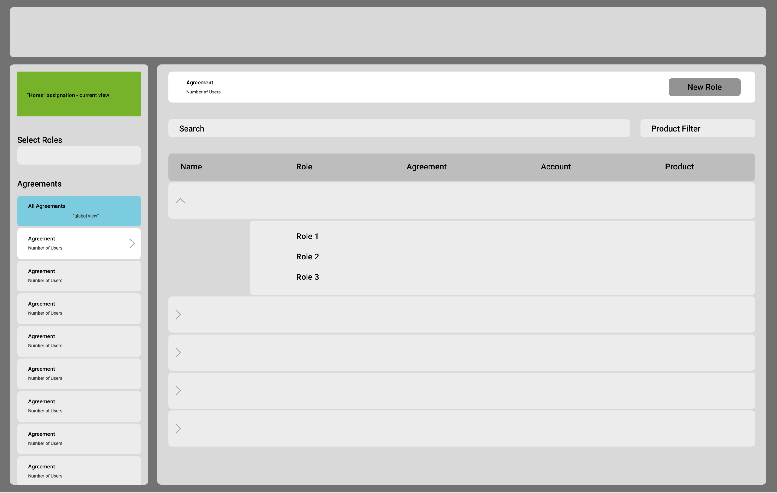
Limited table usability
Nested tables, missing global filters, and poor sorting made it difficult to find and manage users efficiently.
Making users think about complexity
The system forced users to think in backend structures, not in real-world workflows — especially problematic for customers with complex agreement setups.
my role
UX/UI Designer
End-to-end UX ownership
I was responsible for the complete UX and UI redesign of the User Management feature.
This included:
Planning and conducting user research
Translating insights into clear user flows
Designing low- and high-fidelity prototypes
Collaborating closely with Product Owners and Developers
key decisions
A deliberate, user-centered design approach
Rather than redesigning the interface at surface level, the approach focused on simplifying how the system is understood and used — while respecting technical and organizational constraints.
1) Start from real user behavior, not existing screens
User research has been conducted and showed that role and agreement management followed clear real-world patterns that were not reflected in the interface. This insight set the direction for all subsequent design decisions.
Why?
Existing interfaces reflected system history, not how administrators actually manage users and roles.
Trade-off
Required to challenge established structures and investing time in upfront research.
Impact
User Research aligned real workflows of users with concept ideas and gave users more confidence into software outlook.
2) Simplify before expanding functionality
Instead of adding features immediately, I focused on removing friction in:
Reducing the number of multiple views necessary to view associated data
Eliminating nested tables in favor for a better UI
Improving visibility and orientation (e.g. navigation from/to different perspectives on the same user)
Why?
Adding new features would have increased complexity without fixing core usability issues.
Trade-off
Some feature requests were intentionally postponed to prioritize clarity. This needed to be communicated to users actively.
Impact
Reduced cognitive load and faster task completion for everyday user management.
3) Design for scale (but without over-engineering)
Rather than creating separate solutions, the design introduced flexible patterns that adapt to different levels of complexity. This ensured scalability while keeping the interface approachable.
For that, the solution needed to work for:
Small customers with few users
Large organizations with complex role structures
Why?
SMEs and enterprise customers had different needs, but separate solutions would not scale.
Trade-off
The design required more thoughtful patterns instead of quick, tailored fixes for each target group.
Impact
An adaptable interface successfully supports both simple and complex setups.
solution highlights
Fewer steps for complex tasks
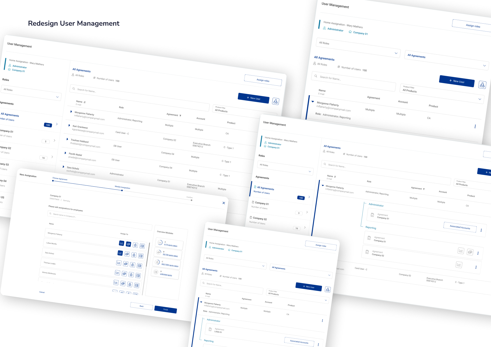
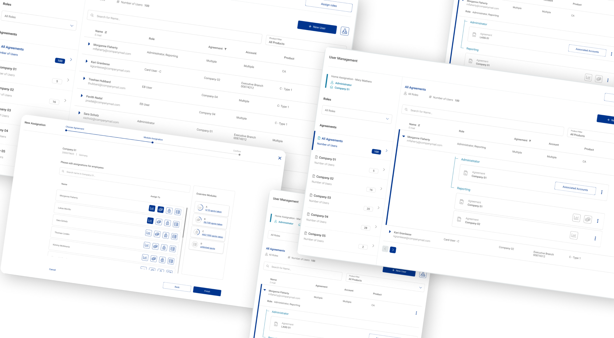
The new user management introduced a simplified table structure for admin users by eliminating nested tables and replacing it with role-specific user data, simultaneously introducing role visbility across agreements. In addition the new assignation flow relieved the pain of multiple views, clicks and confusion by introducing a step-by-step approach for this compex task.
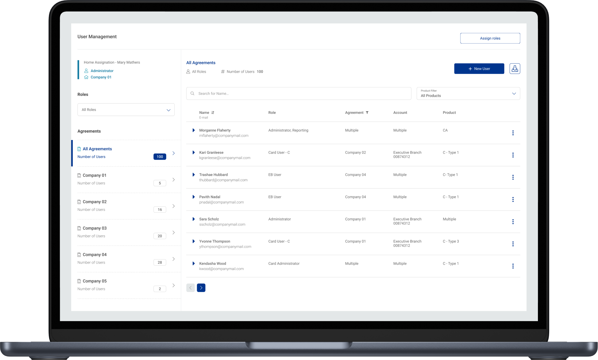
simplified table structure of the (new) user management
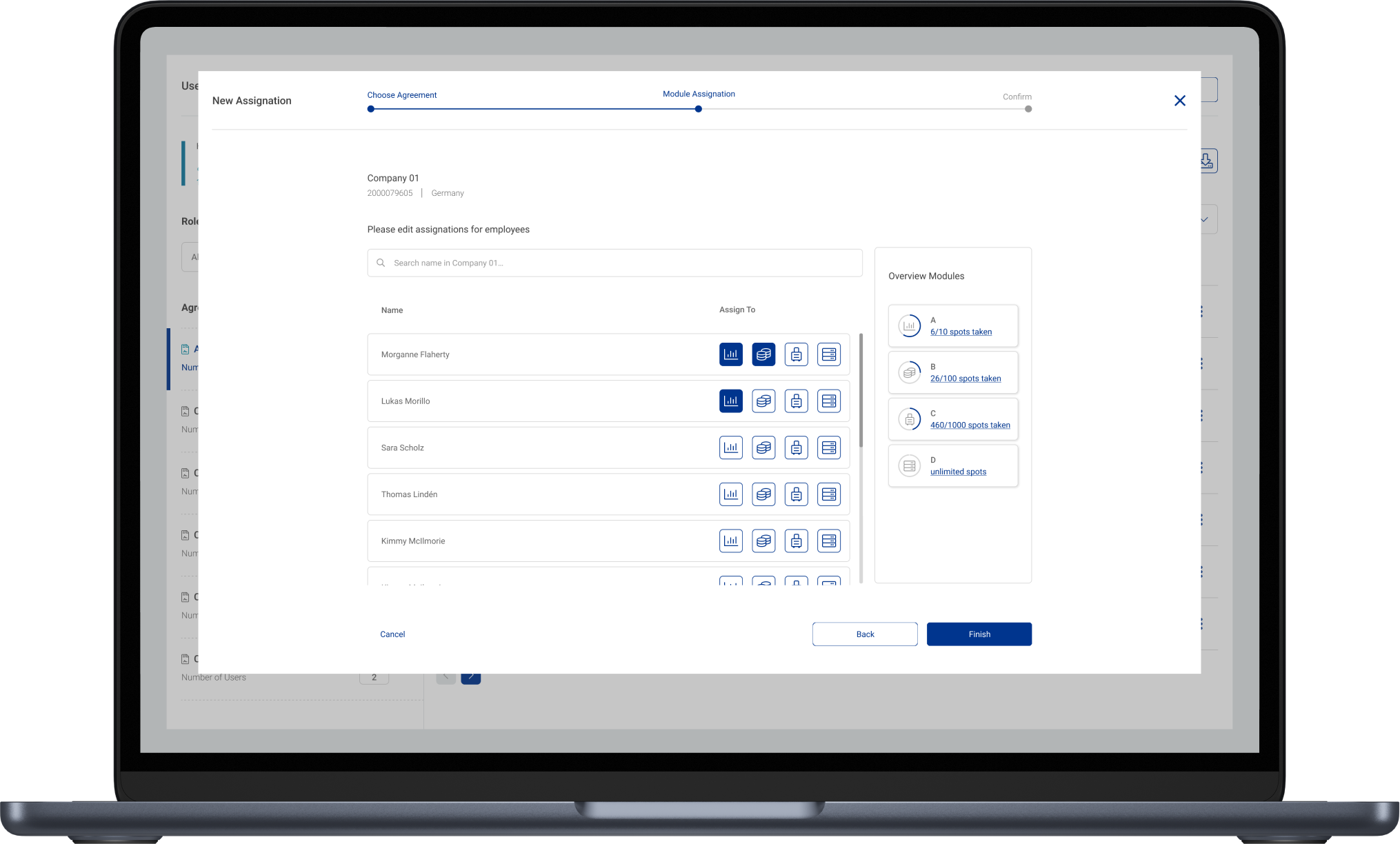
assignation flow for user role - guiding the user through complex steps (one at a time)
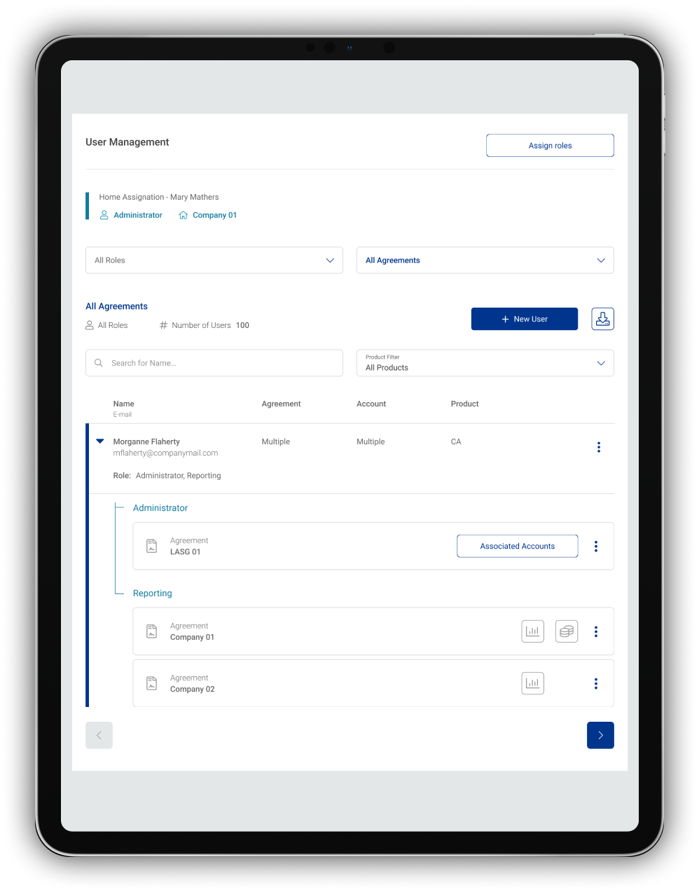
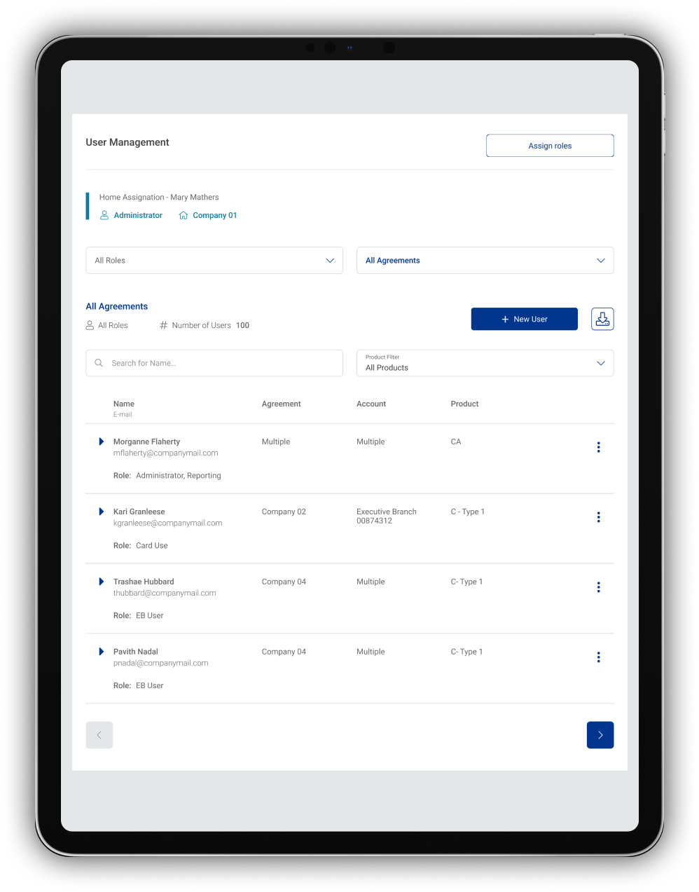
fully responsive version - showing role, products and assignments per user
company impact
Usability gains in a critical workflow
The redesign of the User Management feature led to measurable improvements in usability and efficiency, while remaining compatible with existing platform structures and product constraints. It also improved user confidence in the platform solution.
Task completion & error rates
Measured during usability testing for core administrative tasks such as creating users, assigning roles, and managing permissions, a reduction in task completion could be seen by 35%
25% fewer misassignments and navigation errors due to clearer structure, improved filtering, and reduced view switching
Impact on new users
New administrators were able to complete key actions without additional guidance, indicating improved learnability
Usability testing indicated a decline in user-management-related questions and clarification needs
While the redesign did not fundamentally change the underlying system architecture, the UX improvements significantly increased clarity and efficiency for daily administrative work.
reflection
What enabled impact — and what I’d approach differently
What worked well
Research validated direction, not just solutions
Early user research confirmed that the main issues were structural and conceptual, not visual — helping focus efforts where they mattered most.
Small structural changes can have large UX impact
Even without major information architecture changes, rethinking flows, hierarchy, and visibility led to meaningful usability gains.
What I would improve next time
Not all UX improvements are immediately visible
Some benefits — such as reduced cognitive load and improved confidence — surfaced through behavior rather than explicit feedback. Communication of these benefits through formats like empathy maps into the organization is crucial, to keep project validation and stakeholder buy-in for further "small" UX improvements.